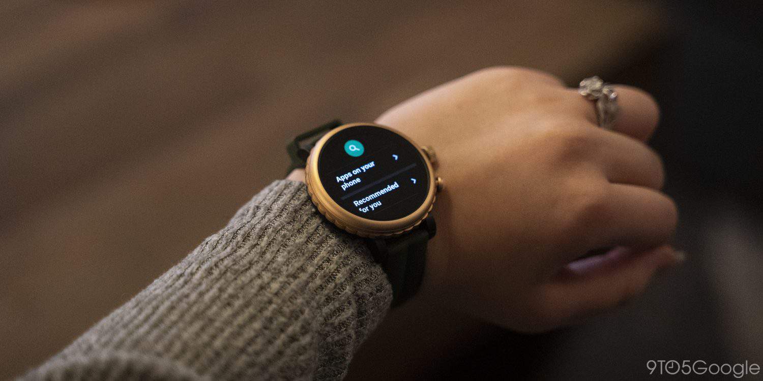
Thanks to some updates, Google’s Wear OS has been getting slightly better over the past several months, but not to the extent it needs to. In its latest attempt to improve things, Google has redesigned the Play Store for Wear OS with some welcome tweaks.
Spotted on Reddit and by one of our tipsters, Google appears to have widely rolled out a Play Store update for all Wear OS users. At first glance, it’s not a radical redesign, but it makes a lot of changes for the better. Firstly, it ditches the pull-down menu that’s been very annoying for quite some time. In the previous design, the menu indicator often covered the search button.
The options that were in that menu have now been moved to the app’s main screen. There are new buttons for My Apps, Accounts, and Settings right at the bottom of the list.
The rest of the Play Store for Wear OS doesn’t appear to have changed much. App listings, for example, are basically unchanged, but I think they now have a darker background. To be honest, it’s hard to tell the difference unless you look side-by-side. Apps on Wear OS aren’t great, so I don’t open the Play Store there very often.

