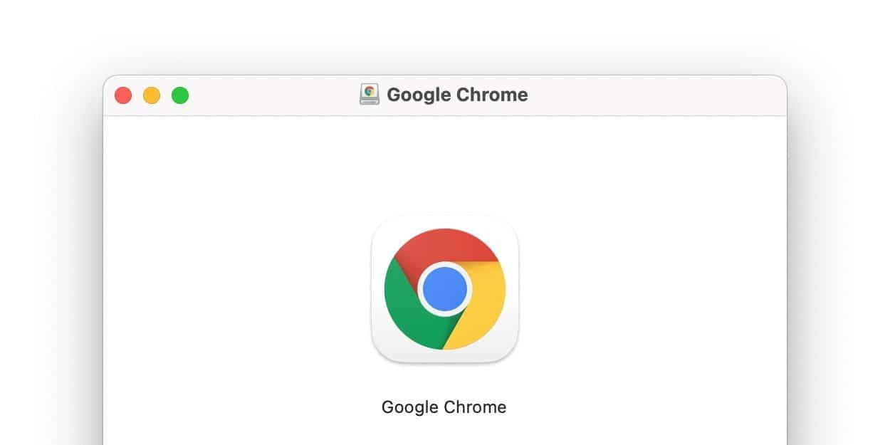
With the latest update to Chrome, Google has launched a new rounded square icon for the browser on macOS. However, it seems another icon redesign is on the way with Google teasing some potential icons for Chrome to better match the design language of macOS Big Sur.
Google Chrome version 87 launched today on Windows and macOS, bringing a host of new features, but the most immediately noticeable change was a new icon for macOS, partially themed to the style of Big Sur. Matching the style of the icon of Chrome for iOS, the new icon simply places the standard Google Chrome icon into a rounded square with a white background.
To make Chrome look and feel more at home on macOS Big Sur, Google seems to be working on a more significant redesign of the browser’s icon. On Twitter this evening, Elvin Hu, a member of Google Chrome’s design team, shared three potential designs to add a flair of Big Sur’s “neumorphism.”
The first design is exactly what you can see as of today’s Chrome 87 release on macOS, while the latter two use light and shadow in different ways to create a sense of depth. The tweet is intended as a way to open the floor to community feedback on which direction makes the most sense.
Elsewhere on Twitter, Alex Ainslie, head of design for Google Chrome, briefly shared about the delicate balance of keeping each of Chrome’s logos across various platforms feeling consistently “Chrome-y,” “Google-y,” and “OS-y” — meaning it matches the design language of a particular operating system.
One of my favorite things about making @googlechrome for ChromeOS, Mac, Windows, Linux, Android, and iOS is that we get to negotiate how to be 1) Chrome-y and 2) Google-y and 3) OS-y all at the same time.

