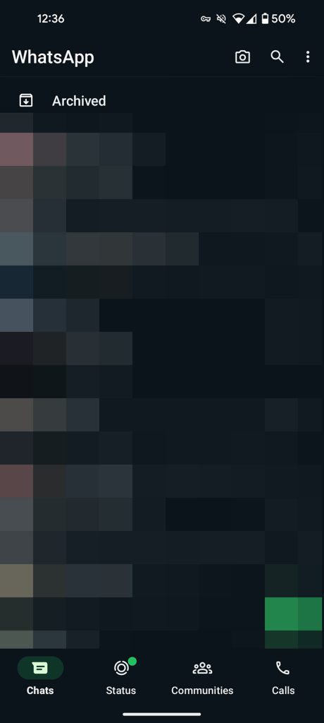
WhatsApp’s improved bottom navbar is officially rolling out to Android users of the cross-party messaging platform.
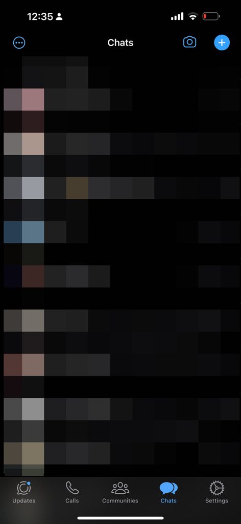
As confirmed by the official WhatsApp X (formerly Twitter) account, the updated navbar replaces the older top navbar and includes the new “Communities” section, while “Status” is now “Updates.” The layout consists of “Chats,” “Updates,” “Communities,” and “Calls.”This change has been sporadically available to WhatsApp Beta users over the past few months, with the interface sometimes disappearing entirely for those on the preview program. It has been available on iPhone for longer, but the order of the navbar is slightly different and omits a dedicated “Settings” button – as shown below:


WhatsApp states that the new navbar is “closer to your thumbs” while the design is “easy on the eyes.” It does fit in better with recent Material 3.0 design principles and looks great on devices that have heavy Material You theming such as the Google Pixel series.

